 HOME
HOME < PREVIOUSNEXT >
Image Effect Palette
The Image Effect Palette allows imported images to be modified and used as fill for Shapes.
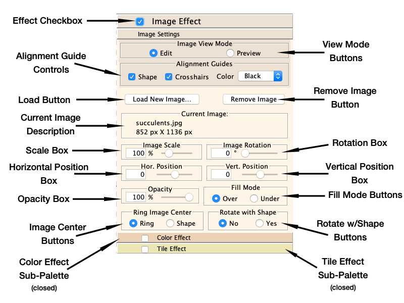
Effect Checkbox
To add an Image effect to a selected Shape layer, click to check the Effect Checkbox. This will open the Image Effect Palette if it is not already open.
If you have not previously assigned Export Settings to your mandala, and have not set the Export "Auto apply" setting in the Preferences, you will be asked to choose Export Settings at this time. See Working with Images for more about this.
If you are adding an Image Effect to the selected Shape for the first time, an Open File Dialog will automatically be displayed. The directory to which this dialog opens defaults to your Documents folder, but can be customized in the Preferences.
If you have a selected Shape with an Image Effect applied, you can disable the effect by un-checking the Effect Checkbox. The image and effect settings are remembered, but they are not drawn. The effect may be re-enabled by checking the Effects Checkbox again.
Image View Mode Buttons
The Image View Mode Buttons control the view shown on the Canvas when the selected layer has an active Image Effect.
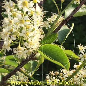
In Edit Mode, the Image Edit View replaces the Mandala View on the Canvas. The Image Edit View shows the image separate from your mandala. The image displays with helpful Alignment Guides. See the first image below for an example of Edit Mode.
You can change not only image attributes in Edit Mode, but also alter the Shape's attributes in the Shape Palette and Ringshape Palette.
Important: It is strongly recommended that you do most of your editing of images in Edit Mode. Your control of the image will be much smoother, since the program does not need to update the whole mandala each time you make a change. It is also only in the Edit Mode that you can change the position of the image on the Canvas by dragging it.
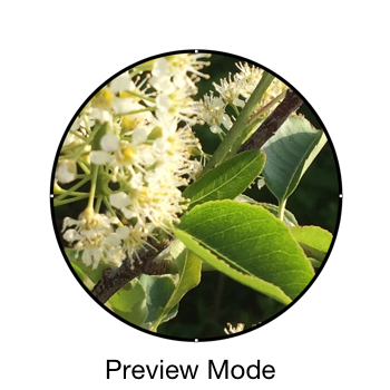
In Preview Mode the Mandala View of your complete mandala is shown on the Canvas with the Image Effect embedded. See the second image below for an example of Preview Mode.
It is still possible to edit the image while in Preview Mode using the controls on the Image Effect Palette and the Color Effect and Tile Effect Sub-Palettes, but be aware that unlike Edit Mode, where the Attribute Boxes directly effect the image while the Slider controls are being dragged, in Preview Mode, the image will not update until the Slider control is released.
As noted above, edit actions in Preview Mode will be less smooth and updates may take an extended time. When editing the image in Preview Mode, be patient. Make one adjustment and wait for the image to update before trying another adjustment.

Alignment Guide Controls
When in Edit Mode, the Image Edit View displays Alignment Guides to make editing the image easier. There are two types of guides and both are active by default.
The Shape Guide shows the outline of the Shape to which the Image Effect is being applied so you can see how the image will line up in the Shape. (Shape selection handles are also displayed to help with visibility, however these handles are not draggable in the Image Edit View.)
The Crosshairs provide vertical and horizontal centerlines to help with centering the image.
The Alignment Guide Controls allow you to enble or disable the Shape Guide or Crosshairs independantly by checking or unchecking the checkboxes. The Color Popup Menu allows you to change the color of the Alignment Guides for better visibility depending on the image content.
Load Image Button
When pressed, the Load Image Button opens an Open File Dialog to choose a new image to load. The directory to which this dialog opens defaults to your Documents folder, but can be customized in the Preferences.
If there is an image already loaded, you will be asked if you wish to remove it, as only one image can be loaded per Shape.
Remove Image Button
Pressing the Remove Image Button immediately removes the current image.
Current Image Description
The Current Image Description displays the file name of the currently loaded image along with it's pixel dimensions.
Image Scale Attribute Box
When an image is loaded, it is scaled in the Image Edit View such that one image pixel will be one pixel when the mandala image is exported. This size corresponds to 100% in the Image Scale Attribute Box.
The Image Scale Attribute Box allows you to scale the image size up or down depending on the effect you wish to create. When you change the scale, MandalaMaker will resample the image, which may result in some loss of output quality. See the Working with Images section for more details.
Image Rotation Attribute Box
The Image Rotation Attribute Box allows you to rotate the image.
Note that this control is not a Rotation Attribute Box as used in other palettes, but rather a Basic Attribute Box with a range from 0° to 360°.
Horizontal and Vertical Position Attribute Boxes
You can move the image horizontally or vertically using the corresponding position attribute box. The range of these controls allows you to move the image any distance up to completely off the Canvas.
When attempting an exact position, select the appropriate control and then move the image one pixel at a time using the arrow keys on the keyboard.
When the Palette is in Edit mode, you can also move the image by dragging it directly on the Canvas. In Preview mode, you can only move the image with these controls.
Opacity Attribute Box
The Opacity Attribute Box controls the Opacity of the image in the mandala. Opacity values of less than 100% will allow mandala elements behind the image to show through to a greater or lesser extent. This includes the Shape's Fill Paint when the Image Effect Palette's Fill Mode is set to Under. Reducing Opacity tends to gray the image.
Fill Mode Buttons
The Fill Mode determines how to draw the Shape when it has both an Image Effect and a Fill Paint.
When the Fill Mode Buttons are set to Over, the Fill Paint is drawn on top of the Image Effect. This will obscure the Image Effect unless the Fill Paint has less than 100% Opacity.
When the Fill Mode Buttons are set to Under, the Image Effect is drawn on top of the Fill Paint. This will hide the Fill Paint unless the image's Opacity is set to less than 100%.
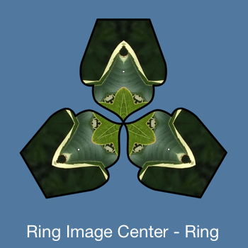
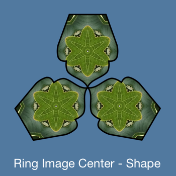
Image Center Buttons
The Image Center Buttons control how the image is drawn when the Shape is a compound shape. The control is only active if the Shape is compound.
When set to Ring, the compound shape is treated as a unit. The image center as seen in the Image Edit View will be in the center of the mandala and the Image Effect will span the whole compound shape. The Shape Guide in the Image Edit View will show the compound shape as it appears in the mandala document.
When set to Shape, the Ringshapes are each filled individually with the Image Effect. The center of the image as seen in the Image Edit View will appear in the center of each Ringshape. The Shape Guide in the Image Edit View will show one individual Ringshape in the center of the view.
Note that this behavior is very like that of the Gradient Base control in the Ringshape Palette.
The images below of a Ring of 3 Pointed Doors show how the same Image Effect looks with the two Image Center settings.
Rotate with Shape Buttons
The Rotate with Shape Buttons are only active when the Image Effect Palette is in Preview Mode.
When set to Yes, rotating the Shape will rotate the Image Effect along with it.
When set to No, the Image Effect remains stationary as the Shape is rotated around it.
If the Shape is a compound shape with the Image Center Buttons set to Shape, and the Rotate with Shape Buttons are set to Yes, the Image Effect will rotate with the Ringshapes as well as the compound shape as a whole.