Working with Shapes
Shapes are the basic building blocks of MandalaMaker drawing. MandalaMaker has basic shapes and compound shapes Compound shapes arrange one or more basic shapes in a particular configuration.
The Shape type is selected from the Shapes Popup of the Shape Palette. A Shape is added to the mandala by clicking the New Shape Button on the Shape Palette. Each type of shape has various attributes which can be set to alter its appearance. Attributes are set either by adjusting the Attribute Boxes and other controls on the Shape Palette and Ringshape Palette (in the case of Compound Shapes).
Some attributes can also be adjusted by dragging the selection handles of a selected shape. When adjusting via the selection handles, holding down modifier keys such as Alt/Option Key or Control Key, will modify which attributes are adjusted by the drag. The shape descriptions below detail the specific behaviors. Holding down the Control Key will allow simultaneous adjustment of all the attributes controlled by a particular handle.
Rotatable shapes have a rotation factor, based on their radial symmetry, that controls how the Rotation attribute is interpreted for that shape. For example, the Doorway shapes have a rotation factor of one, meaning that they can be rotated a full 360 degrees. The Oval has a rotation factor of two which means that its full rotation is 180 degrees, at which point it looks identical to its appearance at 0 degrees. The Star and other multi-pointed shapes have a rotation factor equal to their number of points.
Basic Shapes
The basic shape types are:
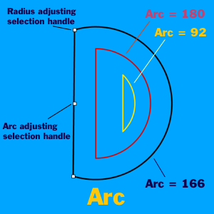
Arc
The Arc shape creates circular segments and has the following adjustable parameters:
Radius
The Arc has a Radius attribute like the Circle. The Radius can be set from the Shape Palette or by dragging one of the Arc's outer selection handles on the circular part of the shape..
Arc
At an Arc value of 0, the shape is non-existant. As the Arc value is increased, the shape grows to a half-moon at 180 and to a full circle at 360. The Arc can be set from the Shape Palette slider or by dragging the central selection handle on the Arc segment of the shape.
Rotation
The Rotation attribute adjusts the Arc's orientation on the Canvas. The rotation factor of the Arc is one, so it may be rotated a full 360°. The Rotation can be set from the Shape Palette's Rotation Attribute Box or by holding down the Alt/Option Key while dragging one of the selection handles.
|
 |
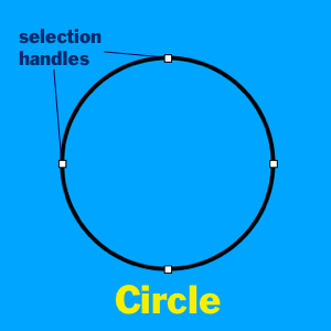
Circle
The Circle is the most basic Shape.
Radius
The only attribute available with the Circle is the Radius. The Radius value is the radius of the Circle in pixels. The Radius can be set by dragging the Radius Slider in the Shape Palette or by dragging one of the selection handles.
|
|
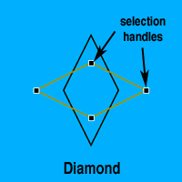
Diamond
The Diamond makes quadrangles defined by their opposite corner-to-corner dimensions. Shapes vary from squares to diamond card suit shapes and beyond.
Width and Length
The Width and Length attributes adjust the corner-to-corner dimensions of the shape. The Width and Length can be set from the Shape Palette or by dragging the appropriate selection handle.
Rotation
The Rotation allows you to rotate the Diamond around its center. The Diamond's rotation factor is two, so it can be rotated through 180°. The Rotation can be set from the Rotation Attribute Box on the Shape Palette or by holding down the Alt/Option Key while dragging one of the selection handles. |
 |
Doorway (Round and Pointed)
The Doorways are traditional motifs that appear in various contexts and cultures including Tibetan mandalas, Gothic rose windows and Middle Eastern art.
Height
The Height adjusts the size of the Doorway. It may be adjusted from the Shape Palette or by dragging one of its selection handles.
Rotation
The rotation factor of the Doorways is one, so they may be rotated 360°. The Rotation can be set from the Rotation Attribute Box on the Shape Palette or by holding down the Alt/Option Key while dragging one of the selection handles. |
|
Egg
The Egg allows the creation of asymmetrical ovoids ranging from "teardrops" to various "egg-like" shapes.
Height
The Height attribute defines the long axis dimension of the shape. The Height can be set either from the Height Slider or by dragging one of the selection handles.
Width 1 & 2
Width 1 and Width 2 adjust the roundness and width of the Egg's two ends. A width of 0 creates a pointed end. For a classic egg shape, set one width to 2 and the other width to 4.
Width 1 and Width 2 can be set only from the Shape Palette sliders.
Rotation
The Rotation allows you to rotate the Egg around its center. The rotation factor of the Egg is one, so it can be rotated 360°. The Rotation can be set from the Shape Palette's Rotation Attribute Box or by holding down the Alt/Option Key while dragging one of the selection handles. |
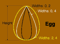
Image needs updating |
Eye
The Eye creates "human eye" or lens shapes.
Length
The Length attribute adjusts the "long" axis dimension of the shape. An Eye of a given Length will be circumscribed by a Circle with the same Radius. The Length can be adjusted using the Length slider, or by dragging the selection handles at the corners of the Eye.
Width
The Width adjusts the "openness" of the Eye. The range of settings for the Length and Width allow for a wide range of shapes, which may or may not look like eyes. The Width can be adjusted using the Width slider, or by dragging the selection handles on the rounded part of the Eye.
Rotation
The Rotation attribute moves the Eye around it's center. The rotation factor of the Eye is two, so the shape can be rotated though 180°. The Rotation can be set from the Shape Palette's Rotation Attribute Box or by holding down the Alt/Option Key while dragging one of the selection handles. |
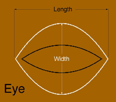
Image needs updating |
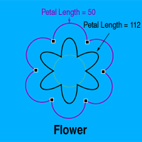
Flower
Radius
The Radius of a Flower represents the radius of a Circle which passes through the cusp points where the petals of the Flower meet. The Radius can be set from the Shape Palette or by dragging one of the Flower's selection handles.
Petal Length
The Petal Length controls the length and shape of the Flower's petals. At 0 the Flower is not a flower shape at all but a regular polygon. A value of 50 creates a Flower with semi-circular petals. Higher values yield Flowers with longer petals. Negative values of this attribute are also available, creating more abstract, but still "flower-like" shapes. The Petal Length must be adjusted from the Shape Palette.
# of Petals
The # of Petals attribute selects the number of petals the Flower will have. The # of Petals must be adjusted from the Shape Palette.
Rotation
The Rotation values for the Flower are similar to those of the Star. The rotation factor of a Flower is equal to it's # of Petals attribute. In this way, a Rotation setting of 180/360 will place the petals of the Flower half way between the petals of a simalar Flower with Rotation of 0/360. The Rotation can be set from the Shape Palette's Rotation Attribute Box or by holding down the Alt/Option Key while dragging one of the selection handles. |
 |
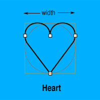
Heart
The Heart draws a classic Valentine heart shape.
Width
The Heart Width attribute represents both the width and height of the Heart. A Heart with a specific Width is as wide and tall as a Circle with the same Radius. A Rectangle with its Width and Height set to the same value as the Heart's Width will perfectly enclose the Heart. The Width can be adjusted in the Shape Palette, or by dragging one of the selection handles.
Rotation
The rotation factor of the Heart is one, so the shape can be rotated through 360°. The Rotation can be set from the Shape Palette's Rotation Attribute Box or by holding down the Alt/Option Key while dragging one of the selection handles. |
 |
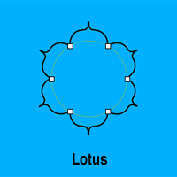
Lotus
The Lotus creates a flower shape with pointed petals as found in traditional Tibetan mandalas. Its behavior is very similar to that of the Flower and has the same attributes which are adjusted in the same ways, except that the Lotus has no Petal Length adjustment. |
 |
Moon
The Moon makes "moon" shapes from fingernail crescents, through quarter, half and gibbous shapes to a full moon circle.
Radius
The Radius attribute acts just as it does in the other circle based shapes described above. The Radius can be set from the Shape Palette or by dragging the selection handles at the tips of theMoon's crescent.
Fullness
The Fullness attribute ranges from 0 to 100. 0 creates a slim line-width crescent, 50 creates a half moon and 100 a full circle. The Fullness can be set either from the Fullness slider, or by dragging the central selection handle of the Moon.
Rotation
The rotation factor of the Moon is one, so the Rotation attribute rotates the Moon through a full circle. The Rotation can be set from the Shape Palette's Rotation Attribute Box or by holding down the Alt/Option Key while dragging one of the selection handles. |
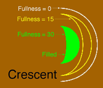
Image needs updating |
 Be Aware: |
In MandalaMaker version 2.x the Moon shape was known as the Crescent.
|
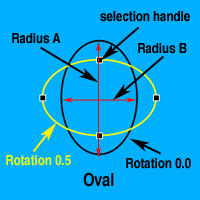
Oval
Radius A & B
The Oval has two radius attributes called Radius A and Radius B. Radius A represents the horizontal size of the Oval when Rotation is set to 0. Radius B represents the vertical size of the Oval at 0 rotation. The Radius A and Radius B attributes can be set using the sliders on the Shape Palette, or by dragging the selection handles on the desired radius of the Oval.
Rotation
The Rotation allows you to rotate the Oval around its center. The rotation factor of the Oval is two, allowing for 180° of rotation. The Rotation can be set from the Rotation Attribute Box on the Shape Palette or by holding down the Alt/Option Key while dragging one of the selection handles. |
 |
Palace
The Palace creates the palace shape used in traditional Tibetan mandalas. The square represents the palace of a deity and the protrusions on the sides represent the doors to the palace.
Width
The Width attribute sets the width of the central square in pixels. A Circle with a Radius of half a given Palace's Width will be perfectly circumscribed by the Palace. The Width can be adjusted in the Shape Palette, or by dragging one of the selection handles.
Door Height
The Door Height sets the distance that the doors protrude from the central square. Be aware that the effects of the Door Width and Throat Width will only be visible if the Door Height is greater than zero. The Door Height must be adjusted from the Shape Palette
Door Width
The Door Width sets the width of the widest part of the doors. If the Door Width is greater than the Width a non-traditional shape will result. The Door Width must be adjusted from the Shape Palette
Throat Width
The Throat Width sets the width of the narrower section of the doors. If the Throat Width is greater than the Door Width a non-traditional shape results. The Throat Width must be adjusted from the Shape Palette
Rotation
The Rotation attribute rotates the design around its center. The rotation factor of the Palace is four, so the shape can be rotated 90°. The Rotation can be set from the Shape Palette's Rotation Attribute Box or by holding down the Alt/Option Key while dragging one of the selection handles. |
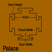
Image needs updating |
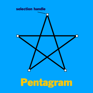
Pentagram
The Pentagram is a shape that has been used symbolically since ancient Greek and Babylonian times. As the name implies, the traditional pentagram is a five-pointed shape, with five lines connecting each point to the points on either side that are two points away.
In MandalaMaker, the Pentagram can have up to 36 points. Regardless of the number of points, the lines connect points that are two points away from each other. Hence, a MandalaMaker Pentagram with six points creates a Star of David.
Radius
The Radius attribute value represents the radius in pixels of a Circle circumscribing the Pentagram. In other words, a Pentagram with given Radius will fit exactly inside a Circle with the same Radius. The Radius can be adjusted from the Radius slider or by dragging the selection handles at the points of the Pentagram.
# of Points
The # of Points attribute selects the number of points that the Pentagram will have. The # of Points must be adjusted from the # of Points slider.
Rotation
The rotation factor of the Pentagram is equal to its # of Points attribute. Setting a Pentagram's Rotation to 180/360 will place its points half way between the points of a similar Pentagram with Rotation set to 0/360. The Rotation can be set from the Shape Palette's Rotation Attribute Box or by holding down the Alt/Option Key while dragging one of the selection handles.
|
|
Rectangle
Width & Height
The Width attribute adjusts the horizontal dimension of the Rectangle when it is in the "upright" position (i.e. with rotation of 0.0). Similarly, the Height attribute adjusts the vertical dimension of the Rectangle. The value of the Width and Height attributes is one half the width or height of the Rectangle in pixels. In this way, a Circle with Radius 60 will be inscribed in a Rectangle with Width and Height both set to 60. The Width and Height attributes can be set using the sliders on the Shape Palette or by dragging the handles on the appropriate side of the Rectangle.
Rotation
The Rotation attribute adjusts the Rectangle's orientation on the Canvas. The rotation factor of the Rectangle is two, so the shape can be rotated through 180°. The Rotation can be adjusted from the Shape Palette, or by holding down the Alt/Option Key while dragging one of the selection handles. |
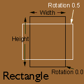
Image needs updating |
Star
The Star draws a regular polygon with a number of adjustable attributes.
Radius
The Radius attribute value represents the radius in pixels of a Circle circumscribing the Star. In other words, a Star with given Radius will fit exactly inside a Circle with the same Radius. The Radius can be adjusted from the Radius slider or by dragging the selection handles at the points of the Star.
# of Points
The # of Points attribute selects the number of points that the Star will have. The # of Points must be adjusted from the # of Points slider.
Rotation
The rotation factor of the Star is equal to its # of Points attribute. Setting a Star's Rotation to 180/360 will place its points half way between the points of a similar Star with Rotation set to 0/360. The Rotation can be set from the Shape Palette's Rotation Attribute Box or by holding down the Alt/Option Key while dragging one of the selection handles.
Sharpness
The Sharpness attribute adjusts the "pointy-ness" of the Star. The Sharpness value represents a percentage of sharpness. At Sharpness of 0 percent, the Star is a regular polygon (i.e. a pentagon, octagon, etc.). At Sharpness 100 percent the Star is so pointy that its points appear as radial lines. The Sharpness can be adjusted with the Sharpness slider or by dragging the selection handles which fall in the "valleys" between points of the Star. |
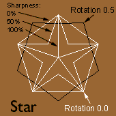
Image needs updating |
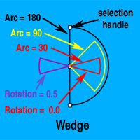
Wedge
The Wedge shape create pie slice shapes (known in mathematics as circular sectors).
Radius
The Wedge has a Radius attribute like the Circle. The Radius can be set from the Shape Palette or by dragging one of the Wedge's selection handles.
Arc
The Arc attribute, adjusts the size of the pie slice drawn. The value of the Arc attribute is the size of the central angle in degrees. At 0 the Wedge is just a radial line, at 90 it is one quarter of a circle, and at 360 it is the same as a Circle of the same radius. The Arc can be set only from the Shape Palette slider.
Rotation
The Rotation attribute adjusts the Wedge's orientation on the Canvas. The rotation factor of the Wedge is one, so the shape can be rotated 360°. The Rotation can be set from the Shape Palette's Rotation Attribute Box or by holding down the Alt/Option Key while dragging one of the selection handles.
|
 |
Yantra
The Yantra creates a traditional Hindu yantra design.
Radius
The Radius sets the size of the design. A Yantra of a given Radius will be perfectly circumscribed by a Circle of the same Radius. The Radius can be set from the Shape Palette or by dragging one of the Yantra's selection handles.
# of Triangles
The # of Triangles attribute sets the number of triangles drawn. Nine triangles create the full traditional yantra. The # of Triangles must be adjusted from the Shape Palette
Rotation
The Rotation attribute rotates the design around its center. The rotation factor of the Yantra is one, so the shape can be rotated 360°. The Rotation can be set from the Shape Palette's Rotation Attribute Box or by holding down the Alt/Option Key while dragging one of the selection handles. |
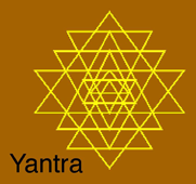
Image needs updating |
Yin-Yang
The Yin-Yang or taijitu is a classic chinese symbol representing both unity and duality. Traditionally the symbol consists of a dark half (yin) and a light half (yang). The yin half will contain a light circular dot and the yang half will feature a dark dot. These dots represent that yin always contains some yang, and vice-versa. In MandalaMaker the individual shape created is one half of the full circular symbol.
Radius
The Radius sets the circular size of the design. A Yin-Yang of a given Radius will be perfectly circumscribed by a Circle of the same Radius. The Radius can be set from the Shape Palette or by dragging one of the Yin-Yang's selection handles.
Style
There are four settings for the Style attribute, numbered one through four. Style one creates a yin-yang half with an apparent clockwise dynamic and no central dot. Style two is clockwise with a dot. Style three is counter-clockwise with no dot and style four is counter-clockwise with a dot. Note that the "dot" is actually a "hole" in the shape through which background object will show through. The Style must be adjusted from the Shape Palette
Rotation
The Rotation attribute rotates the design around its circular center. The rotation factor of the Yin-Yang is one, so the shape can be rotated 360°. The Rotation can be set from the Shape Palette's Rotation Attribute Box or by holding down the Alt/Option Key while dragging one of the selection handles.
To create the traditional full circular symbol:
- Add a single Yin-Yang with Style one or three. Set the fill to a dark color.
- While this shape is selected, press the Add Shape button.
- If your initial shape was style one, change this shape to style two. If the original was style three, make the new shape style four.
- Set the fill of the new shape to a light color.
- While this shape is selected, press the Add Shape button again.
- Rotate the new shape 180° and set the Style back to your style from step one.
- While this shape is selected, press the Add Shape button again.
- Change the Style to your choice in step three.
- Set the fill to your dark color from step one.
|
Image needs updating |
Compound Shapes
Compound shapes arrange one or more basic shapes in a particular configuration. The attributes of the compound shape are controlled by the Shape Palette. The attributes of the component basic shapes are controlled by the RingShape Palette. There are two ways to select a compound shape. Selecting in the usual way by clicking the shape on the canvas or clicking the shape's Layer Pane in the Layer Palette selects the compound shape as a whole, showing selection handles which control the attributes of the compound shape. If you hold down the Alt/Option Key while selecting, you select the basic shapes and see selection handles which control the attributes of the basic shapes.
The compound shapes are:
Planet
The Planet draws a single shape as a planet in orbit around the centerpoint. The "orbit" does not show, and is drawn in the diagram only to make it clear how the Planet's position is determined. The Planet attributes set the size of the "orbit" and the position of the planet in the orbit. To change the shape and attributes of the orbiting shape you use the Ringshape Palette.
Radius
The Radius attribute sets the radius of the "orbit" that the Planet shape sits on. In other words, the Radius is the distance from the mandala's centerpoint to the centerpoint of the Planet shape. The Radius can be set from the Shape Palette or by dragging one of the Planet's selection handles.
Rotation
The Rotation attribute determines the position of the Planet shape in the orbit. The rotation factor of the Planet is one so the planet shape can be moved 360° around the center. The Rotation can be set from the Shape Palette's Rotation Attribute Box or by holding down the Alt/Option Key while dragging one of the selection handles. By holding down the Control Key, you can move the planet shape anywhere on the canvas. |
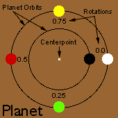
Image needs updating |
Ring of Shapes
You can think of the Ring of Shapes as an orbit containing mulitple planets at regular intervals, or as an invisible star with a shape at each point. The Ring of Shape attributes set the size of the invisible star or orbit, how many shapes are in the ring and the position of the shapes in the ring. To change the shape that appears in the ring and set its attributes you use the Ringshape Palette.
Radius
The Radius attribute sets the size of the invisible orbit or star that determines the placement of the shapes. The Radius can be set from the Shape Palette or by dragging one of the Ring of Shapes's selection handles.
# of Shapes
The # of Shapes attribute sets the number of shapes that appear in the ring, or the number of points in the invisible star. The # of Shapes must be adjusted from the Shape Palette
Rotation
The Rotation determines where the shapes appear on the ring. The rotation factor of the Ring of Shapes is equal to its # of Shapes attribute. Setting the Rotation to 180/360 places the shapes in this ring half way between the shapes of a similar ring with Rotation set to 0/360. The Rotation can be set from the Shape Palette's Rotation Attribute Box or by holding down the Alt/Option Key while dragging one of the selection handles. |
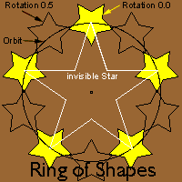
Image needs updating |
Grid of Shapes
The Grid of Shapes creates rows and columns of basic shapes in a regular grid. The Grid of Shape attributes set the spacing of the shapes. To change the shape that appears in the grid and set its attributes you use the Ringshape Palette.
Vertical Spacing
The Vertical Spacing attribute sets the vertical distance between centers of the shapes. The Vertical Spacing must be set from the Shape Palette.
Horizontal Spacing
The Horizontal Spacing attribute sets the horizontal distance between centers of the shapes. The Horizontal Spacing must be adjusted from the Shape Palette
|
Image needs updating |
Matrix of Shapes
The Matrix of Shapes creates a field of basic shapes. The Matrix of Shape attributes set the angle and spacing of the shapes. To change the shape that appears in the grid and set its attributes you use the Ringshape Palette.
Spacing
The Spacing attribute sets the distance between centers of the shapes. The Spacing must be set from the Shape Palette.
Angle
The Angle attribute adjusts the angle between centers of the shapes. The Angle must be adjusted from the Shape Palette
|
Image needs updating |
 HOME
HOME < PREVIOUSNEXT >